Mobile first, later : 10 Steps for retrospectively making your Drupal site responsive

On April 21st, Google updated their mobile search algorithms to boost the rankings of mobile-friendly web pages, whilst conversely decreasing rankings for pages that have been designed only for large screens. This change is likely to have a big impact on many Drupal sites, and ComputerMinds have seen a surge in requests for retrofitting responsive themes onto existing Drupal sites. More information about the change - which is commonly reffered to as ‘mobilegeddon’ can be found here http://googlewebmastercentral.blogspot.co.uk/2015/04/faqs-april-21st-mobile-friendly.html
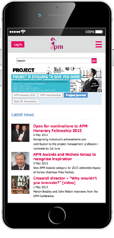
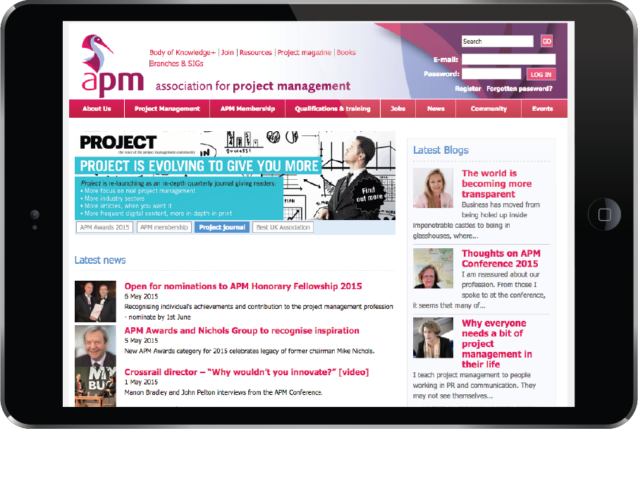
Due to these new changes, we have recently completed a responsive upgrade to a clients website - https://apm.org.uk - which was previously unresponsive and only displayed well at a typical desktop browser resolution (960px).
Now post upgrade, the site is fully responsive, displays and functions well across mobile devices, tablets and desktop browsers. Crucially the site is now receiving a near perfect score from the google mobile friendly test tool.
We followed a 10 step process
1 - Work out the appropriate breakpoints where the site will transition from mobile to tablet to desktop, based on your current design. For APM these were; 320px - Mobile, 768px - Tablet, 960px - Desktop. We chose not to have separate mobile/tablet/desktop style sheets, instead adding the appropriate media queries into the respective modular css files. Using the excellent breakpoints.js, we also setup the same breakpoints in Javascript that we had defined in the CSS. Breakpoints.js allows us to fire custom events when the browser enters/exits the breakpoints that we’ve defined, which in turn enables us to run specific code in reaction to the firing of these custom events.
2 - Create a mobile device specific menu that would replace the standard desktop menu. APM had a large number of links in the primary and secondary menus, so we decided to go for the “hamburger” menu approach to maximise the use of available space, showing both primary and secondary menu links on the side of the screen once the menu is activated. To achieve this - we initially hide the primary & secondary menus with css, then use javascript to move them into a separate “offscreen” div. With some CSS and Javascript trickery we can make the menu initially appear offscreen. Once the hamburger menu icon is activated we ‘slide’ it in from offscreen, keeping half of the page body visible with the menu taking up the rest of the screen. This delivers the familiar menu experience found across many mobile websites and apps. We also have a non-javascript fallback which displays the slightly restyled menus in the site header instead, to ensure people can still navigate the website with javascript disabled.
3 - Change the grid system (if applicable) from a fixed grid system into a responsive one that will work well at all different resolutions. APM had previously followed a 960px fixed grid system, consisting of 16 grid columns used to form a typical “three column” layout. We switched the site base theme to Zen 5.x to give us a responsive layout with a fluid grid system to work with. For desktop we retain the same three column layout, for tablet we made both sidebars drop into one, and mobile causes the page to go into a single column layout. All the styling for this is now fully responsive so between the various resolutions the content re-sizes and scales appropriately.
4 - Blocks - Move any blocks around in the page structure at the different breakpoints to ensure the blocks are still displayed in appropriate places. To achieve this we used a combination of CSS and Javascript breakpoints we had set up. We also had key page elements such as the menu & login blocks duplicated in the markup in different places, showing and hiding at the appropriate breakpoints. It is important to do this technique as by simply moving everything with javascript can cause a “popping” effect upon initial page load.
5 - Redesign the site header, footer to improve the appearance and functionality for mobile and tablet devices. For the APM header we dropped the header background image for a solid colour, resized and centrally aligned the logo, moved the login block and menu offscreen with new buttons at the top to activate them. The footer changes consisted of resizing the images and tidying up the styling of text and links.
6 - Tidy up, optimise any legacy CSS and update any code that may be referencing fixed pixel values for font sizes, widths, etc. Previously the APM site had all of its CSS in one single style sheet that had accumulated a lot of code over the years, becoming unmanageable. Taking a SMACCS approach, we refactored the single style sheet into modular files, removed any duplicate css, fixed old rules, changed fixed pixel font-sizes to EM’s, and fixed pixel widths into percentages.
7 - Optimise any applicable site assets, including; reducing the size of images, minifying scripts, spriting images, reducing the number of http requests & more.
8 - Upgrade image site assets where possible from bitmap to vector, to cater for the ever expanding range of high resolution devices available today. We recreated some of the assets including; menu home icon, breadcrumb separator, menu separator in the SVG file format, a vector format that scales nicely for higher resolution devices.
Although supported in most of the recent desktop and mobile browsers - using SVG’s for a CSS background-image is not fully supported in all browsers so we have to add a fallback. Using the Javascript library Modernizr, we can test for SVG support, and then use a normal image as a fallback if the browser does not support SVG.
9 - Cross device, cross browser, in-depth testing of the new responsive site to ensure we achieve high compatibility with as many different devices and modern browsers as possible.
10 - Analyse the site using the Google mobile test tool, make changes including adjusting tap target sizes accordingly to improve usability. For APM this included; increasing the size of the login button, mobile menu button, input buttons, select lists, menu links, made whole teaser articles linkable, and more to enhance the mobile browsing experience.